Thursday 7 March 2013

Storyboards

This is the storyboard we created for my Music Video for the song 'Stay Awake'. Creating this storyboard was extremely important as it helped us to stay organised and up to date when filming each shot, and it helped us in the editing process when we had to put each shot in the correct order. As well as informing us what shot we needed to film it also allowed us to remember how long each shot had to last, what lighting we needed, what props we needed and also what location we had to film it in.
When it came to actually filming my music video I did stick to a lot of the shots from the storyboard, but I did make some changes, such as filming extra shots that I thought would help develop the music videos narrative (like the sparkler scene), and I also changed the length of time that some of the shots lasted, as in the editing process I decided to make some shorts last for a shorter amount of time to build up the excitement for my target audience.


Monday 17 December 2012

Group Digipak

After analysing all of our groups second digipaks we decided that we would use my digipak as our final product. We all agreed that it contains most of the conventions of a dance genre digipak and we felt it reflected our artists image the best.

This is our final digipak:
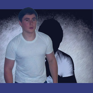
I created this sketched effect by editing a photo of our artist on photoshop. The shadowed effect adds a sense of mystery to the artists which links well with the lyrics of the single 'Stay Awake' which we are creating a music video for, as the lyrics are more dark and deep compared to other dance songs. The font of the writing for the artists name, Mike Smith, and the album name, 'Stay Awkae', is bold and clear and the white colour makes it stand out clearly on the dark background. The colour scheme for my digipak was a dark blue colour as it is quite bright, which represnts the dance genre, but also quite deep which again adds to the mystery.


This is the thank you note I created which is found in most digipaks. It gives our artist, Mike Smith, a chance to thank everyone that has helped him with his album, and this usually excites the reader as they will enjoy be recognised for helping the artist.
I used the reverse colour scheme of the front cover, as I put the deep purple/blue colour around the edges to make it more eye catching, with the black colour in the centre to help make the white font stand out more.


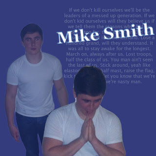
This is just a page with pictures of the artist on to entertain the audience. The image shows the artist, Mike Smith, looking directly in front of him which could give the idea that he is looking at the reader. I again kept to the blue colour scheme and i used the same effect on the background image as I did on the front cover. This image acts as a kind of shadow as it is balck and positioned behind the other picture.


This is quite a simple slide as it will be covered by the actual CD. I continued to use the same blue/purple colour scheme throughout this slide and copied the same font from the front cover to keep my digipak consistent. I also put a light blue glow around the text in order to make it stand out more on the blue/purple background.
This is another picture slide to entertain the audience. I put a fade effect on to these two images of the artist to make them blend well into eachother, yet still stand out on the blue background. To make this slide more interesting I wrote some of the lyrics to one of Mike Smiths biggest hits, Stay Awake, in a faded white font. I then added Mikes Smiths name over the top of it in a bright white colour with a blue glow around it to make it stand out more. Having images of the artist in the digipak is a common convention of dance genre digipaks as the audience want to know as much as they can about the artist and they want to be able to see their image and lifestyle.


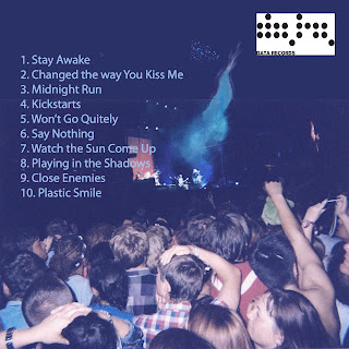
This is the back cover that I created on photoshop, the image is a typical convention of dance genre music videos, as it shows a fun and exciting atmosohere in a crowd watching the artist perform. This will excite the audience as they will want to listen to his music if they know this many people already enjoy listening to him. I included the necessary details on the back cover that are typical conventions of digipaks, such as the track list and the artists record labels logo.


This is Carrie's Digipak:
 
This is Carrie's second Digipak attempt which we were also considering using as our final product, it relates to the dance genre very well with its use of bright colours, bold fonts and close up picture of the artist.
This is Carrie's front cover for Mike Smith's digipak, it is very bright with the fireworks in the background, this relates well to the dance genre as one of its main characteristics is bright vcolours. Also, in the foreground is a close up photo of the artist himself, this would attract the audiences attention as they would be intrigued by the image as it would allow them to see the artists image and ligfestyle as they will be alble to see what he wears. Also, the bold yellow font of the artists name and album title will help to attract the artists attention as it is bright and also connotes ideas of fun which relates to the dance genre.


Carrie's Thank You page is also very bright which again links to the dance genre conventions and our group decided we liked the bright blue border with the bold orange font, as it contrastes well with the black centre background. The last sentence which is in capital letters stands out on this slide and it would excite the readers as this sentence is trying to flatter them and encourage them to continue supporting the artist, Mike Smith.


Our group liked this slide of Carrie's as the red font is very bold on the black background and contrasts well with the white border. Also she edited some of the artists song lyrics in a smaller and faded font to go behind the albums title, this looks very good on the dark backgound. This slide is where the actual album CD will be, so when the CD is in it's case/digipak, this slide will be covered.


This is Carrie's back cover, it uses the same colour scheme as her previous slides, as it has the black background with the blue border and red writing. This slide is also good as it uses the artists record labels logo, our group decided that this was a very important feature to include on the back cover in order to make the digipak look more professional, and we also decided we liked the blue and black colour scheme, this colour scheme is similar to our final digipak.

Analysis of Artists Digipak

This is the digipak that our group decided to use as our final one, and it was my second attempt at making a digipak for our artist. I created using photoshop for my artist, Mike Smith. It follows some conventions of dance genre digipaks, but not all of these conventions as I wanted to make my artist slightly diverse and to challenge some of the conventions, such as bright colours.
The colour I kept throughout my digipak is a purple/blue colour, this is not necessarily a typical colour to be used on dance genre digipaks as they usually consist of bright yellows, reds and light blues etc, in order to reflect the party and club scene. However, the main single on our artists digipak is 'Stay Awake, this is the song we are creating a music video for, and the lyrics in this song have more meaning than the usual dance song which is about love and girls, so I decided the colouring on my digipak should reflect these serious lyrics, but still with a fun twist.
The image I used on the front cover is of our artist Mike Smith, this is a typical convention of most digipaks as it allows the audience to instantly see that it is his album and it also helps the audience create a relationship with the artist as they can see his emotions in this close up photo, and the expression on the artists face will also help to suggest what type of mood the songs are within the album.
This is the front cover I created for the album, I continued to use the purple/blue colour in the centre of the background and put a black border around it to represent some of the darker meanings of his songs inside the album, such as the younger generation messing their lives up through drink and drugs. I then placed a close up photo of Mike Smith in the centre of the cover so that the audience would focus on his face first and be able to see whos album it is. I used a paintbrush effect in order to make the photo of Mike Smith black and white as this also links to the lyrics of many of the songs.
A typical colour used on dance genre digipaks is white, as it is bright and could be used to represent the lights used in clubs and at gigs, so I decided to write the artists name and album title in white in order for it to link to the dance genre conventions slightly, and also the white colour contrasts with the darker background making the artists name stand out on the cover.

This is the thank you note which I created, this will be the first slide when you open up the digipak. A thank you page is a typical convention of most album digipaks, so I created this page in order to make my digipak look professional and conventional to the dance genre. The artists target audience will be expecting to see this thank you note and will be happy to see it is there, as fans enjoy seeing that their favourite artists appreciate their support. I still wanted this slide to look similar to the front cover in order for it to follow a pattern and look professional, but I decided to reverse the colours by having the centre of this slide black with a purple/blue border. By having the background black, I was able to use the conventional white colour again for the text which made it contrast with the background and stand out. The effect of the white writing on the balckground could represent the lights used in a very dark club atmosphere, so this is conventional to a dance genre digipak as they usually try and look like and represent the club and dance scene.

I decided to keep this slide simple as this is just where the actual CD will go, so most of the backgorund will be covered when the CD is in place. So I just used two different shades of the Purple/blue colour in order to stick with the theme of my digipak and wrote the artists name in the centre. The way the darker colour blends into the lighter shade could represent the contents of Mike Smiths CD as we know that some of his lyrics are quite dark but are put over an upbeat music track. For his name I used the same text font and colour in order to keep it continuous throughout the digipak and also to let the audience know as soon as they see this text it will be related to the artist 'Mike Smith'.

This is the backcover of my digipak, and as most of my digipak is quite dark, I decided to make the back cover slightly more exciting and bright in order to correspond with the dance genre conventions. If i'd have kept the whole digipak dark and plain it may have put some of the target audience off of buying the album, as they may have thought that the music in the album wouldn't be the usual dance music they listen to, so I wanted to make this back cover more exciting in order to appeal to Mike Smiths target audience.
I took the image myself at Reading Festival on a disposable camera and then scanned it on to the computer in order to get this grainy effect and lighter contrasting colours. This crowd makes the artist Mike Smith look very popular as the audience will see that he has had a lot of fans go to see him live, so this will appeal to the target audience as before they buy thealbum they will know that he is a popular artist and is likely to appeal to them. The light blue smoke and lighting contrasts with the dark backdrop and makes the back cover more exciting as they look like the type of smoke and lights that you get at gigs and clubs, so this will exite and appeal to the target audience.
I also included the track list on the back as this is a neccessity for the audiecne and a typical convention of all digipak backcovers, as it alows the audeicne to see what songs have been put on to the album. I made this text a light blue colour, much like the smoke, in order for it to contrast with the darker background again and to make it stand out. Lastly, I also included Mike Smiths record labels logo iin the top right hand corner as this is a typical convention of all digipaks and it allows the fans to see who their favourite arist is signed to so they can possibly look the record label up for more information on the artist and to also ry and find some other artists also on this record label.
If I could cahngwe anything about my digipak, it would be to get a clearer and better picture of the artist to use on my front cover, as I think a front on close up picture of him would look better and more professional and would enable the audience to convey the artists emotions more easily. However, I am very happy with how my digipak turned out, and I am glad I used the same colours throughout to make it consistent. This draft digipak will help me with my final digipak as I now know how to use certain features of photoshop, and I know which conventions of the dance genre I want to keep on my digipak and which ones I want to challenge in order to make my artist more diverse.


Sunday 16 December 2012

Digipak Reflection

This was the first Digipak I created for my artist Mike Smith, i tried to follow many of the typical conventions of dance genre digipkas, such as an image of the artist, his name in a bold font, bright colours, and a fun picture. However, this was not my most successful digipak as it didn't have a professional edge to it and the colours don't stand out as much as they could. However, the image on the front cover blended in well and is large enough for the audience to see what the artist looks like and to see the emotions conveyed in his facial expression. Also the font and colour of the artists name stands out well on the darker background and forces the reader to read the artists name, so this draws the readers attention.
 

This is the back cover of my first digipak, the image shows a typical convention of the dance genre as it shows a fun and lively atmosphere at a gig. This image will excite the reader as they will want to listen to the artists music if they see that this large crowd has already seen him live and had as much fun as they look like they are having. Also the bright colours that stand out in the image will draw the readers attention. In additional I included some necessary information such as the song list and the record companies logo.

This thank you message will excite the reader as they know the artist appreciates their support and it allows the fans to get some recognition. I followed the same colour scheme on this page as I did on the front cover to keep it consistent and to make the writing stand out on the darker background.


This images of the artist will excite the viewer as they get to see what the artist and they can see his emotions which may convey what the songs sound like and what messages they convey in their lyrics.
 
I could definitely make some changes to this digipak, such as using better images, brighter colours and including another album title to make it more attractive to the target audience. I believe my second attempt at a digipak was much more successful, although this first attempt does contain many features which i did decide to keep in my final digipak, for example; the song list, record label logo, the image on the back cover and the use of a close up image on the front cover.

Sunday 9 December 2012

Planning Editing

Planning what editing effects and tools I wanted to use when beginning the editing process was essential as it allowed me to visualise what I wanted my music video to look like and it enabled me to know how I wanted to portray my narrative and concept, and my artist to my target audience. I decided to use many conventional editing tools and styles to the dance genre in my music video in order to excite the audience and allow my narrative and concept to flow well within my music video, making it easier for my audience to understand my music video.

These are some of the editing tools I decided to use in my music video:
  • Rewind Effect: This effect links well with the dance genre and my chosen song, Stay Awake, as it allowed the visuals to link with the music (which was a main feature of Goodwin's theory). I used the rewind effect after we see the main girl leave her house and get into the artists car, so after he begins to drive away the whole scene is reversed. This effect helped the music video to follow its narrative as it allowed the audience to see the breaking relationship between the girl, who later abuses alcohol and drugs, and the artist, who does not give into the peer pressure of alcohol and drugs.

  • Mirror: This effect allowed me to create a distorted shot which links to the concept of drugs and alcohol, as these substances can give people distorted and blurry vision. The mirror effect also went well with the beat of the music, as I used it when a car door is seen being slammed a few times, so the mirror effect just emphasised the banging sound the closing doors would have had. Also, one of the lines in the song mentions going 'into wonderland' which also adds to the reason of the effect as I wanted to create a distorted yet vivid image.

  • Fast Forward Effect: This effect allowed my music video visuals to follow the music well, as my song is a conventional dance song with a fast paced beat, so I had to use the fast forwarded effect in order to keep the visuals up with the pace of the song. I also wanted to use the fast forwarding effect in order to excite my audience and to make them want to continue watching the music video. In addition the fast paced visuals adds a bit of chaos to my music video which links strongly to the party scene within my music video and the concept of drugs and alcohol. This effect also helped me to create the perfect representation for my artist, as in my music video I added some out-take clips of the artist messing around and I added this fast forward effect to it which enables the audience to see the fun and lively side of the artist without the help of alcohol and drugs, so this represents my artist in a very positive way.

  • Colour Saturation/Contrast: I edited the colour saturation and contrast of some shots in order to make it lighter and to add warmth to the shot, as I wanted a conventional dance music video which makes the audience feel good and excites them. I also used this to add lighting to the party scene shots to replicate the look of strobe lighting and to make the scene look more exciting to translate what the atmosphere of a party that played the artists music would look like.

 
  • Glow and Colour Balance: I used the glow effect in some of my shots in order to make it look more vibrant and fun in order for my music video to be conventional to the dance genre. I also used the colour balance tool to help make some shots brighter or darker, and I made some shots have a bit more of a red balance to it so that it would reflect the lights in a concert or club. The glow effect helped represent my artist positively as it put a white glow around his body which conveys ideas of innocence and good nature, so the audience would hopefully decide they like my artist and want to listen to more of his music. I also used the glow effect and red colour balance on a shot with the main girl after she falls off the bed in order to add to the concept of drink and drugs and show the audience that although she did give in to the pressure of drink and drugs once she is still a normal, good teenager.

Overall
Overall I think my editing styles are very conventional to the dance genre as they mainly connote positive and exciting moods. I also think my editing styles will definitely help the development of my music videos narrative and concepts and allow the target audience to understand what is happening more and enjoy the video. I am happy with the editing tools and styles I have decided to use as they create emphasis on specific shots which are important to the narrative and it helps my music video's visuals to link with the music and lyrics, making the video flow more easily and look more like a professional music video. My editing effects will also help to represent my artist in a positive way, and some of the fast paced editing reflects the busy lifestyle of a music artist, but the other effects, such as the glow, represents how passionate my artist is to his music and how his song does have a slightly deeper concept than some other conventional dance songs.

Saturday 8 December 2012

Planning Lighting and Colour

Before we start filming our music video we have to consider the lighting we want to use in each scene. Deciding what lighting we want to use is especially important when we are considering the scenes which will be filmed outside as we will be using natural light, so we have to make sure we film at the right time of day to get the right lighting effect we want.
Although in some scenes we plan to use very little lighting in order to give off a house party and club vibe, these shots will include some bright colours in clothing, make up and some special effects, so even though the lighting will be dark we will be able to get across the characteristics of the dance genre through these hints of bright colours. 

Natural/Dim lighting

We are likely to film the performance based side of the music video in slightly dim lighting to give a partially negative and gloomy spin on the video, as the lyrics of the song are putting the younger generation down. So we will film these shots in a forest or open field in the afternoon/evening, and the coverage from the trees will also help to create the shadowed gloomy effect. Although we plan to film these shots in dim lighting, it will be natural lighting, that is why the time we film these shots is important. By using natural lighting it adds a sense of realism as it makes it more realistic to the audience, so this may appeal to them as it enables them to relate to the artist. Natural lighting will be a big benefit for our production as in the outside environment we would not be able to bring lighting which needs to be plugged in, so the natural lighting is useful and neccessary, so we we will have to be careful when planning what time we will film to make our music video more effective.


Red Filter
In some of the first few shots we plan to put a red filter or tint over the footage in order to give an eerie and destructive vibe as the artists eyes flash on to the screen. We want this red filter to make the shot which flashes on screen for a few second look disjointed and make the eyes look more bloodshot, which will connote ideas that the artist has been awake for a long time and possibly on drugs. Coloured filters are often used in music videos, but a red filter is not a conventional lighting or colour use in music videos as it is quite a dark colour which connotes things of an evil sense, which is not what dance music videos usually want to conntoe as they prefer to show a happy dance and club vibe.

Due to using natural lighting later in the day, a lot of our music video will be shot in low key lighting, and in the party scenes we will purposefully create low key lighting in order to make it look like the inside of a club, which is a common feature of dance music videos.
We may use some high key lighting in shots which have the main girl in them in order to connote ideas of innocence and purity. But our music video will mainly stick to the use of low key lighting as there will be many references to drugs, alcohol and smoking in it, which are often given a dark effect to connote the damaging effects that these substances can have on people.


We will use many different colours throughout our music video as this is conventional to a dance music video due to the usual atmospheres of clubs, raves and parties. We plan to use sparklers in some of our party scenes, so when we edit our footage we will be able to make these sparklers (which will be used outside) stand out more to create a fun and playful vibe. I think the use of sparklers will help to make our music video look like a professional dance music video as it will make the teenagers in the dance scenes look wild and out of control. Also, the sparklers will help our production look more effective as during the editing process we will be able to add a blurring effect and this will connote the idea that the teenagers in the party scene are seeing through blurry drunk and distorted eyes.


To add to the conventions of a dance music video we will also use live footage from a concert which includes lots of coloured and strobe lighting which will link to the beat of the song and will help my music video follow the dance conventions. The footage is not still and this also adds the distorted and lively atmosphere and also helps to distort the lighting adding to the drunk teenage theme. This lighting will also excite the audience and make them want to see our artist live due to the lively and fun atmosphere.

Friday 7 December 2012

Planning Locations

When we created the storyboard for our music video we had to consider and decide which locations we should film in, in order to make our music video look professional and also relate to the storyline and follow the conventions of the dance genre.

Our key locations whilst filming are:
1. A forest
2. Inside a house
3. In the garden
4. In the car

A Forest


We will only be filming the performance based side of the music video in the forest, so all of the action in the forest will be our artist singing and dancing to the camera. We decided on the forest location as it looks slightly eerie which relates to the lyrics slightly and also because within the forest we can get many different shots as there are grassy areas, a pond and the general forest with lots of trees.
The forest is a wide open area which will give us a chance to test different shots to see what we feel looks best. One of the main difficulties we may find when filming in the forest is the weather, as it is an open area if it rains we will get wet so we have to make sure we bring a cover to put over the equipment to ensure it doesn't get damaged and also bring spare clothes in order to prevent any of the cast or crew from getting too cold and ill. If it were to rain, we may have to postpone the filming and go and film in a location which does not require being outside. Also, another problem we may encounter is lighting, due to it being winter it gets darker earlier so we must make sure that we  film at a suitable time in order for our shots to have good lighting and be clear.

Inside a Dark Party Room


Inside a dark room, possibly a house is one of the main locations as it is where the party will happen. The place we film in is likely to be the house of a member in our filming group, or a black drama studio, and it will be easier to control the lighting and weather inside these locations due to the professional lighting, making it more convenient to film in. We will be able to film a range of shots within the house and/or drama studio due to there being very few limitations and it will be easier for us to create a party atmosphere inside rather than outside. Also inside the house/drama studio it will be easier for us to make it look like there is a bigger crowd as it is a confined space, whereas if we were filming in an open field it would look like there were very few people at the party. During the party shots we will have people dancing and jumping whilst drinking alcohol and making a bit of a mess. So this will link strongly with the dance music video characteristics. Also it will be easier for us to control the lighting inside the house/drama studio with the use of dimmer light switches, coloured filter lights and strobe lights.

Garden


In the garden we will also film some party scenes, we will film these scenes at night so that it is dark outside, but we will use some lights, such as the lights in the decking, so that we will be able to see what is happening in the shots. In the garden we intend to have everyone still partying and drinking and we will also have some people playing with fireworks, and we will put a n effect on this when we edit the footage to put it in slow motion. This shot with the sparklers does come with some health and safety risks as sparklers can be dangerous if they are not handled cautiously, so we will have to be extra careful when filming this shot. Also, like in the forest, we will have to be careful with the weather as we will be unable to film this shot in the rain.

Inside and outside the Car


Inside the car we we film the artist and the main girl talking to each other as they drive to the off licence to buy alcohol and then drive to the party. We will put empty alcohol bottles and cigarette packets in the car for the audience to see in order to keep the idea of a messed up generation running throughout the music video in order for the visuals to relate to the lyrics. The only limitation we could have when filming these shots is traffic, so we will have to make sure that we film these shots when traffic is at a minimum to in order continuous filming. Also a danger with filming these shots is the driver potentially being distracted, so we will have to make sure we do not distract the driver whilst we film these shots as this could potentially be dangerous.

Outside a House


Outside a house will be a minor location as it will only be viewed in our music video for a few seconds. The house we will use is one of the group members houses, as this is more convinient and more practical as we can film this scene at any time. This location will benefit from the use of natural lighting, much like the forest, so it will help the audience relate to the artist as it will be a natural shot with not many special effects, making it more relatable, also due to it being a normal house rather than a luxury mansion will help the audience build a relationship with the artist as they will see he leads quite a normal lifestyle. So this will go against the usual conventions of a dance music video, as they usually show off the artists luxury lifestyle.