The colour I kept throughout my digipak is a purple/blue colour, this is not necessarily a typical colour to be used on dance genre digipaks as they usually consist of bright yellows, reds and light blues etc, in order to reflect the party and club scene. However, the main single on our artists digipak is 'Stay Awake, this is the song we are creating a music video for, and the lyrics in this song have more meaning than the usual dance song which is about love and girls, so I decided the colouring on my digipak should reflect these serious lyrics, but still with a fun twist.
The image I used on the front cover is of our artist Mike Smith, this is a typical convention of most digipaks as it allows the audience to instantly see that it is his album and it also helps the audience create a relationship with the artist as they can see his emotions in this close up photo, and the expression on the artists face will also help to suggest what type of mood the songs are within the album.

This is the front cover I created for the album, I continued to use the purple/blue colour in the centre of the background and put a black border around it to represent some of the darker meanings of his songs inside the album, such as the younger generation messing their lives up through drink and drugs. I then placed a close up photo of Mike Smith in the centre of the cover so that the audience would focus on his face first and be able to see whos album it is. I used a paintbrush effect in order to make the photo of Mike Smith black and white as this also links to the lyrics of many of the songs.
A typical colour used on dance genre digipaks is white, as it is bright and could be used to represent the lights used in clubs and at gigs, so I decided to write the artists name and album title in white in order for it to link to the dance genre conventions slightly, and also the white colour contrasts with the darker background making the artists name stand out on the cover.

This is the thank you note which I created, this will be the first slide when you open up the digipak. A thank you page is a typical convention of most album digipaks, so I created this page in order to make my digipak look professional and conventional to the dance genre. The artists target audience will be expecting to see this thank you note and will be happy to see it is there, as fans enjoy seeing that their favourite artists appreciate their support. I still wanted this slide to look similar to the front cover in order for it to follow a pattern and look professional, but I decided to reverse the colours by having the centre of this slide black with a purple/blue border. By having the background black, I was able to use the conventional white colour again for the text which made it contrast with the background and stand out. The effect of the white writing on the balckground could represent the lights used in a very dark club atmosphere, so this is conventional to a dance genre digipak as they usually try and look like and represent the club and dance scene.

I decided to keep this slide simple as this is just where the actual CD will go, so most of the backgorund will be covered when the CD is in place. So I just used two different shades of the Purple/blue colour in order to stick with the theme of my digipak and wrote the artists name in the centre. The way the darker colour blends into the lighter shade could represent the contents of Mike Smiths CD as we know that some of his lyrics are quite dark but are put over an upbeat music track. For his name I used the same text font and colour in order to keep it continuous throughout the digipak and also to let the audience know as soon as they see this text it will be related to the artist 'Mike Smith'.

 This is the backcover of my digipak, and as most of my digipak is quite dark, I decided to make the back cover slightly more exciting and bright in order to correspond with the dance genre conventions. If i'd have kept the whole digipak dark and plain it may have put some of the target audience off of buying the album, as they may have thought that the music in the album wouldn't be the usual dance music they listen to, so I wanted to make this back cover more exciting in order to appeal to Mike Smiths target audience.
I took the image myself at Reading Festival on a disposable camera and then scanned it on to the computer in order to get this grainy effect and lighter contrasting colours. This crowd makes the artist Mike Smith look very popular as the audience will see that he has had a lot of fans go to see him live, so this will appeal to the target audience as before they buy thealbum they will know that he is a popular artist and is likely to appeal to them. The light blue smoke and lighting contrasts with the dark backdrop and makes the back cover more exciting as they look like the type of smoke and lights that you get at gigs and clubs, so this will exite and appeal to the target audience.
If I could cahngwe anything about my digipak, it would be to get a clearer and better picture of the artist to use on my front cover, as I think a front on close up picture of him would look better and more professional and would enable the audience to convey the artists emotions more easily. However, I am very happy with how my digipak turned out, and I am glad I used the same colours throughout to make it consistent. This draft digipak will help me with my final digipak as I now know how to use certain features of photoshop, and I know which conventions of the dance genre I want to keep on my digipak and which ones I want to challenge in order to make my artist more diverse.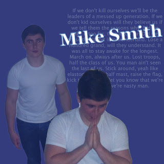

This post and your previous analysis of your digipak helps to show some of the changes that you have made to your work. You have considered the choices and decisions well, but further discussion of the conventions is needed throughout.
ReplyDelete